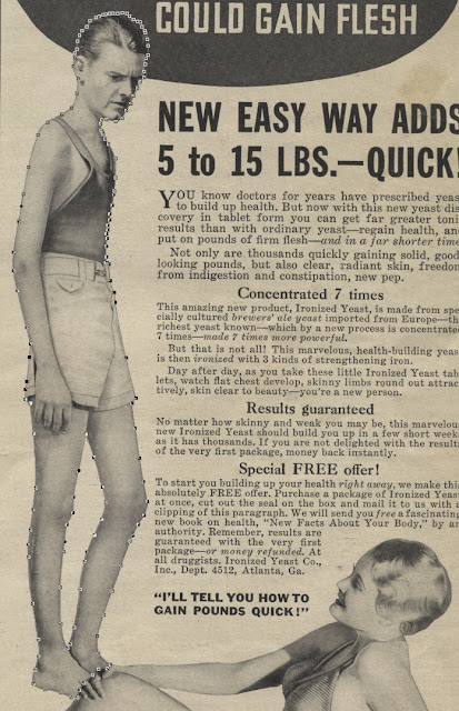
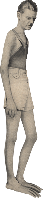
Mmmmm, flesh! Wonderful and delightful... depending greatly on whose you're picturing, of course. This ad from 1934 is for ironized yeast. You have to read the whole thing to sort of figure that out, but it's there, right at the end. It's weird how they're shy about their name... which sounds more like an ingredient than a company name. Imagine if every company were that straightforward. "Drink new Sugar Water! The choice of a new generation."
The skinny guy in this ad is frowning at the girl, wishing he could "gain flesh". Who talks like that? Our old buddy Nineteen Thirty-Four, that's who! Man, Thirty-Four, you're one creepy dude. Go ahead and try it. Stare hard at someone today and mutter about how you'd like to "gain flesh". See how that goes down with your fellow humans.
The guy in the ad looks like a light bulb, with his too-big head. It's almost as if he were Photoshopped or something, but we know that, back in '34, you'd need a PC the size of a planet to run Photoshop. Nope. All they had were airbrushes.
But
we have Photohsop! Let's pop this light bulb out of his ad so he can live on, in your hard drive, to one day frown creepily at something else perhaps.
If you don't have P-shop, just read along and dream of the day when you get your very own planetputer, so you can create seamless visual wizardry like this.
P.A.G! Graphic Blandishment and Photoshoppery Brigade! Assemble!
Pkshoww! I need you to do a standard extraction procedure on ol' Bulby there, and do screen grabs every step of the way. Hop to it! Move! Move!
FYI: This next bit is pretty much for Photoshop beginners. If you're some kind of seasoned pro, you can go do something else or just practice looking smug.
Photoshop is pretty much just selecting areas of pixels and doing things to them. Almost every tool available to you does one of those two things in various fancy ways.
First thing you'll need is the Pen Tool. In case you're not 112 years old and have never owned a fountain pen, it's the thing in the tool bar that looks like an arrowhead... in case you're three hundred to sixty thousand years old and own a bow and arrow.
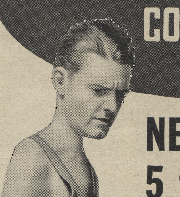 |
| Start click-and-dragging your way around Bulby. Try to remember only to create a new control point when you need your line to change direction, as opposed to just dropping a new point every few pixels. Down that road madness lay. |
 |
| Don't forget to do the opening between his legs. Heh. |
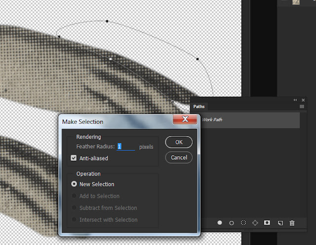
Once your path is complete, in the Paths palette (which can be opened in the pulldown menu WINDOW/PATHS), click the obscure stack of lines in the upper right. Some people who have never seen a hamburger call this "the hamburger". It will open a popout menu. Tell it to MAKE SELECTION.
Photoshop will then ask you if you want to feather the selection. Sure, why not? One pixel sounds pretty good. Depending on the resolution of the image, a pixel may be not enough, just right, or too much. Trust your eyes. Photohsop will let you feather a selection by a fraction of a pixel, too. So, in case one pixel is too much, you can try .5, or .2, etc., etc.
Now that Bulby is selected and feathered, he's ready to get peeled out of the ad like a sticker. The quickest way to do this is by using the key command CTRL J. Press them simultaneously. If you're on a Mac, the CTRL key is the "command" key, which I believe has a thing that looks like a clover on it.
This CTRL+J command takes a selected area of pixels and tears it off onto a new layer in exactly the same spot. Don't believe me? Open up the layers palette (yes WINDOW/LAYERS) and see for yourself. Bulby should be a layer above the "bacnground" layer.
By clicking the eye next to the background layer, you can hide it, and see Bulby on a transparent background, which in most graphics programs is represented by a grey and white checkered pattern.
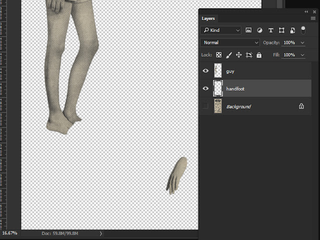
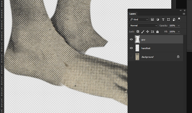
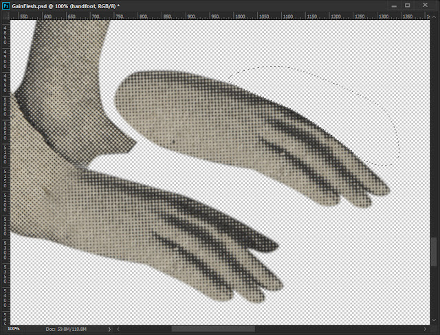
But his feet! They're incomplete! Not to worry. We will use our Photoshop Superpowers to seamlessly complete the feet in a perfectly undetectable and natural way.
When you really think about it, feet are pretty much just hands for your legs, right? Even more so if you're a monkey. And we're got some hands right in this very picture. Go get em!
Turn the background layer back on and highlight that layer in the layers palette. This tells P-Shop you need to work on that layer.
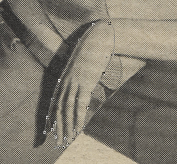 |
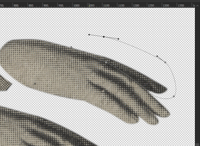
Using your newfound pen tool powers, make a path around the girl's hand. Zoom in if you need to, by using the hotkeys CTRL - or CTRL +. Those zoom you in and out. Now you know two hotey commands. It's like you invented this thing.
Remember when you made a selection from the path a little while ago? Too many steps, right? Fuck that shit. This is quicker. |
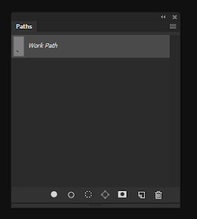
Any path you make with the pen tool will appear in the PATHS palette (open it with the pulldown menu WINDOW/PATHS). You can make a selection out of a path by just holding CTRL and clicking on "work path". Boom. Done.
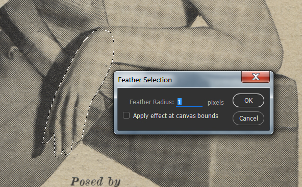 |
| Once a selection is made, feather the edge by one pixel. There's a hotkey for this (SHIFT F6), but you can use the pulldown menu SELECT/MODIFY/FEATHER. |
 |
| By using CTRL J, put the selected hand on its own layer. Bulby's foot is going to be perfect. |
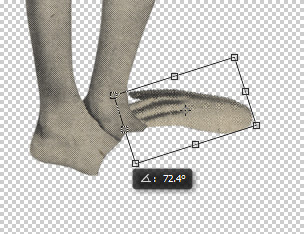 |
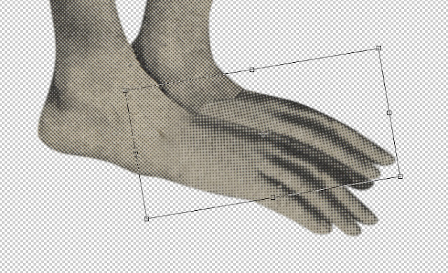
| It's pointing the wrong way! And, rotating it (CTRL T, for "transform") wont' fix that. Nomatter. |
Use EDIT/TRANSFORM/FLIP HORIZONTAL to , duh, flip horizontal. Now you can finish the transform.
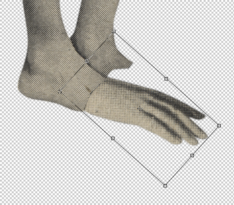 |
| A little rotation and scaling can all be done while still in the "transform". When the handfoot looks to have size and proportion that's perfect and natural and not at all weird, hit ENTER. |
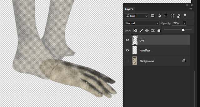 |
| The seam between the two layers needs to be softer. In the layers palette, you can adjust the opacity of Bulby to see howmuch overlap you have. |
In the tool bar, get the eraser tool. It sort of looks like an eraser. By pressing F5, you can open the BRUSH palette. Look for a brush tip that's pretty soft. Also, turn the opacity of the brush all the way up. We'll use the soft edge of the brush to softly fade off the edge of Bulby's foot.
 |
| Using the soft eraser brush you've made, just dither away the hard edge on Bulby's leg. There's still some weird gap down at the bottom of his handfoot, though. |
We're going to use a magical and much-abused tool to fix that. The Clone Stamp tool!
It's in the tool bar, and looks like - wonder of wonders - a rubber stamp!
The clone stamp tool works by sampling an area of pixels, and then painting them into a different area as you go. First, get the clone stamp tool by clicking on it.
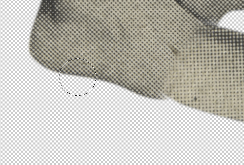 |
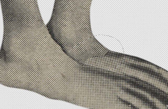
| We need to make the underside of his foot angle upwards to meet the underside of his new handfoot. Check the layers palette to be sure you're working on the layer with his heel and ankle on it. With the clone stamp tool active, hold ALT and click the part of his foot we want to "borrow". You'll notice your brush will have a little preview of the sampled area in it. This is meant to help you align the bit you're going to paint. It may take some trial and error, but the part near his heel will bridge that funny gap to the right. |
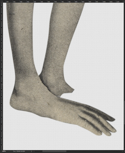 |
See? It's nearly perfect! There's just a tonal mismatch between the front and back of Bulby's handfoot. Since they're separate layers, it's easy to fix.
Click the layer with his fingertoes on it. Then, hit CTRL U, for "hue/saturation" adjustment. |
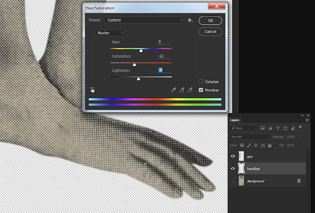 |
| The fingertoes are too yellow. Saturation down by 21 and darken by 8, and Bulby's own bulbmother wouldn't know we did anything at all to him! |
But humans have two feet, and Bulby needs two, too. Click the layer with his fingertoes on it, and hit CTRL J. This duplicates the layer. You can also use the LAYER pulldown to access the DUPLICATE LAYER command.
 |
To help hide the fact that one handfoot is just a copy of the other one, let's delete that one fingertoe in back. We'll just pretend there's a fourth fingertoe there when we slide this handfoot behind the other.
Get the old pen tool out and trace the toefinger we need to slice off. Hold still, Bulby. This may hurt a lot! Like before, go to the paths palette and CTRL click the path to make it a selection. |
 |
| Now, feather the selection by one pixel. use SHIFT 5 to make that happen. |
 |
| Hitting the DELETE key will amputate Bulby's fingertoe. Man, skinny men just can't get a break. |
Next, we'll move the foot into position with the move tool. You can slide over and click on the move tool, if you're a loser, or you can be a cool guy and just hit V (for moVe).
 |
| Once his totally not copied handfoot is in place, rotate it just like before with the good old CTRL T command. |
Nearly done. We need to soften the seam between his back foot and its toefingers. We'll use the eraser again, but well make a selection to keep from erasing any of the front handfoot.
 |
| Draw a selection of the back handfoot, carefully leaving out any of the front one. Then, using the eraser like before, smooth out the foot/fingertoes transition by erasing the front edge of his ankle or foot or whatever you call it. |
 |
| Click for 1600 px. |
There! Now save him out as a PNG (to preserve his background transparency) Bulby is ready to frown angrily at whatever you want! Aren't you lucky?
You're welcome!
All Bulby wanted to do was to "gain flesh", and thanks to Photoshop, he got what he wanted. He gained some fleshy handfeet. And, in the end, isn't that what really matters?